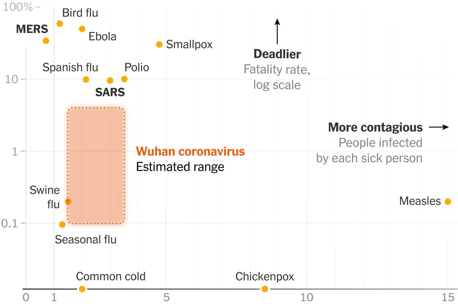
Graph from NYT on coronavirus. It's not much harmful than common cold. The axis are infectious vs mortality. The whole orange bar is the range of possibilities. Worst case is still better than the bad ones we experienced.
I won't spend exorbitant amount of money now on face masks, as prices have already doubled now.
